运行结果(2020-2-4日数据)
数据来源
news.qq.com/zt2020/page/feiyan.htm

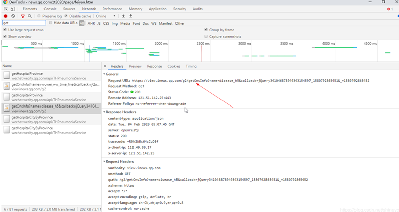
抓包分析
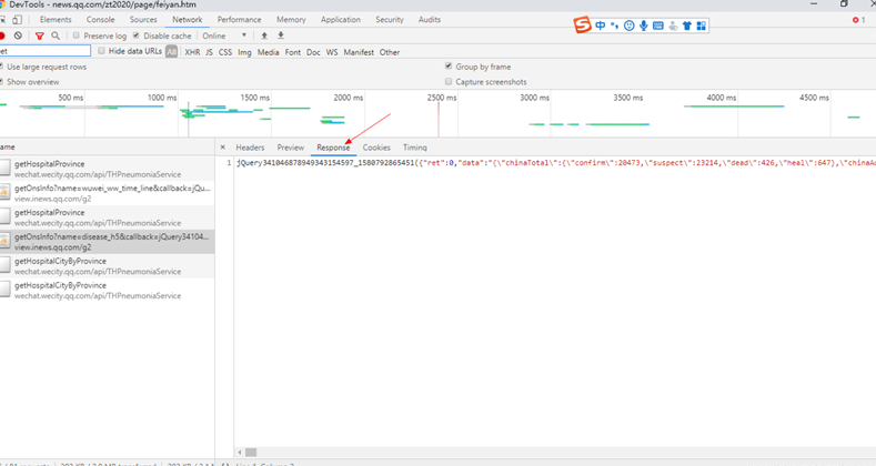
日报数据格式
"chinaDayList": [{
		"date": "01.13",
		"confirm": "41",
		"suspect": "0",
		"dead": "1",
		"heal": "0"
	}, {
		"date": "01.14",
		"confirm": "41",
		"suspect": "0",
		"dead": "1",
		"heal": "0"
	}, {
		"date": "01.15",
		"confirm": "41",
		"suspect": "0",
		"dead": "2",
		"heal": "5"
	}, {
	。。。。。。
全国各地疫情数据格式
	"lastUpdateTime": "2020-02-04 12:43:19",
	"areaTree": [{
		"name": "中国",
		"children": [{
			"name": "湖北",
			"children": [{
				"name": "武汉",
				"total": {
					"confirm": 6384,
					"suspect": 0,
					"dead": 313,
					"heal": 303
				},
				"today": {
					"confirm": 1242,
					"suspect": 0,
					"dead": 48,
					"heal": 79
				}
			}, {
				"name": "黄冈",
				"total": {
					"confirm": 1422,
					"suspect": 0,
					"dead": 19,
					"heal": 36
				},
				"today": {
					"confirm": 176,
					"suspect": 0,
					"dead": 2,
					"heal": 9
				}
			}, {
			。。。。。。
地图数据
github.com/dongli/china-shapefiles
代码实现
#%%
import time, json, requests
from datetime import datetime
import matplotlib
import matplotlib.pyplot as plt
import matplotlib.dates as mdates
from matplotlib.font_manager import FontProperties
from mpl_toolkits.basemap import Basemap
from matplotlib.patches import Polygon
import numpy as np
import jsonpath
plt.rcParams['font.sans-serif'] = ['SimHei'] # 用来正常显示中文标签
plt.rcParams['axes.unicode_minus'] = False # 用来正常显示负号
#%%
# 全国疫情地区分布(省级确诊病例)
def catch_cn_disease_dis():
timestamp = '%d'%int(time.time()*1000)
url_area = ('https://view.inews.qq.com/g2/getOnsInfo?name=disease_h5'
'&callback=&_=') + timestamp
world_data = json.loads(requests.get(url=url_area).json()['data'])
china_data = jsonpath.jsonpath(world_data,
expr='$.areaTree[0].children[*]')
list_province = jsonpath.jsonpath(china_data, expr='$[*].name')
list_province_confirm = jsonpath.jsonpath(china_data, expr='$[*].total.confirm')
dic_province_confirm = dict(zip(list_province, list_province_confirm))
return dic_province_confirm
area_data = catch_cn_disease_dis()
print(area_data)
#%%
# 抓取全国疫情按日期分布
'''
数据源:
"chinaDayList": [{
"date": "01.13",
"confirm": "41",
"suspect": "0",
"dead": "1",
"heal": "0"
}, {
"date": "01.14",
"confirm": "41",
"suspect": "0",
"dead": "1",
"heal": "0"
}
'''
def catch_cn_daily_dis():
timestamp = '%d'%int(time.time()*1000)
url_area = ('https://view.inews.qq.com/g2/getOnsInfo?name=disease_h5'
'&callback=&_=') + timestamp
world_data = json.loads(requests.get(url=url_area).json()['data'])
china_daily_data = jsonpath.jsonpath(world_data,
expr='$.chinaDayList[*]')
# 其实没必要单独用list存储,json可读性已经很好了;这里这样写仅是为了少该点老版本的代码
list_dates = list() # 日期
list_confirms = list() # 确诊
list_suspects = list() # 疑似
list_deads = list() # 死亡
list_heals = list() # 治愈
for item in china_daily_data:
month, day = item['date'].split('.')
list_dates.append(datetime.strptime('2020-%s-%s'%(month, day), '%Y-%m-%d'))
list_confirms.append(int(item['confirm']))
list_suspects.append(int(item['suspect']))
list_deads.append(int(item['dead']))
list_heals.append(int(item['heal']))
return list_dates, list_confirms, list_suspects, list_deads, list_heals
list_date, list_confirm, list_suspect, list_dead, list_heal = catch_cn_daily_dis()
print(list_date)
#%%
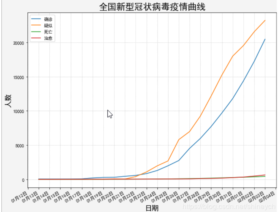
# 绘制每日确诊和死亡数据
def plot_cn_daily():
# list_date, list_confirm, list_suspect, list_dead, list_heal = catch_cn_daily_dis()
plt.figure('novel coronavirus', facecolor='#f4f4f4', figsize=(10, 8))
plt.title('全国新型冠状病毒疫情曲线', fontsize=20)
print('日期元素数:', len(list_date), "\n确诊元素数:", len(list_confirm))
plt.plot(list_date, list_confirm, label='确诊')
plt.plot(list_date, list_suspect, label='疑似')
plt.plot(list_date, list_dead, label='死亡')
plt.plot(list_date, list_heal, label='治愈')
xaxis = plt.gca().xaxis
# x轴刻度为1天
xaxis.set_major_locator(matplotlib.dates.DayLocator(bymonthday=None, interval=1, tz=None))
xaxis.set_major_formatter(mdates.DateFormatter('%m月%d日'))
plt.gcf().autofmt_xdate() # 优化标注(自动倾斜)
plt.grid(linestyle=':') # 显示网格
plt.xlabel('日期',fontsize=16)
plt.ylabel('人数',fontsize=16)
plt.legend(loc='best')
plot_cn_daily()
#%%
# 绘制全国省级行政区域确诊分布图
count_iter = 0
def plot_cn_disease_dis():
# area_data = catch_area_distribution()
font = FontProperties(fname='res/coure.fon', size=14)
# 经纬度范围
lat_min = 10 # 纬度
lat_max = 60
lon_min = 70 # 经度
lon_max = 140
# 标签颜色和文本
legend_handles = [
matplotlib.patches.Patch(color='#7FFFAA', alpha=1, linewidth=0),
matplotlib.patches.Patch(color='#ffaa85', alpha=1, linewidth=0),
matplotlib.patches.Patch(color='#ff7b69', alpha=1, linewidth=0),
matplotlib.patches.Patch(color='#bf2121', alpha=1, linewidth=0),
matplotlib.patches.Patch(color='#7f1818', alpha=1, linewidth=0),
]
legend_labels = ['0人', '1-10人', '11-100人', '101-1000人', '>1000人']
fig = plt.figure(facecolor='#f4f4f4', figsize=(10, 8))
# 新建区域
axes = fig.add_axes((0.1, 0.1, 0.8, 0.8)) # left, bottom, width, height, figure的百分比,从figure 10%的位置开始绘制, 宽高是figure的80%
axes.set_title('全国新型冠状病毒疫情地图(确诊)', fontsize=20) # fontproperties=font 设置失败
# bbox_to_anchor(num1, num2), num1用于控制legend的左右移动,值越大越向右边移动,num2用于控制legend的上下移动,值越大,越向上移动。
axes.legend(legend_handles, legend_labels, bbox_to_anchor=(0.5, -0.11), loc='lower center', ncol=5) # prop=font
china_map = Basemap(llcrnrlon=lon_min, urcrnrlon=lon_max, llcrnrlat=lat_min, urcrnrlat=lat_max, resolution='l', ax=axes)
# labels=[True,False,False,False] 分别代表 [left,right,top,bottom]
china_map.drawparallels(np.arange(lat_min,lat_max,10), labels=[1,0,0,0]) # 画经度线
china_map.drawmeridians(np.arange(lon_min,lon_max,10), labels=[0,0,0,1]) # 画纬度线
china_map.drawcoastlines(color='black') # 洲际线
china_map.drawcountries(color='red') # 国界线
china_map.drawmapboundary(fill_color = 'aqua')
# 画中国国内省界和九段线
china_map.readshapefile('res/china-shapefiles-master/china', 'province', drawbounds=True)
china_map.readshapefile('res/china-shapefiles-master/china_nine_dotted_line', 'section', drawbounds=True)
global count_iter
count_iter = 0
# 内外循环不能对调,地图中每个省的数据有多条(绘制每一个shape,可以去查一下第一条“台湾省”的数据)
for info, shape in zip(china_map.province_info, china_map.province):
pname = info['OWNER'].strip('\x00')
fcname = info['FCNAME'].strip('\x00')
if pname != fcname: # 不绘制海岛
continue
is_reported = False # 西藏没有疫情,数据源就不取不到其数据
for prov_name in area_data.keys():
count_iter += 1
if prov_name in pname:
is_reported = True
if area_data[prov_name] == 0:
color = '#f0f0f0'
elif area_data[prov_name] <= 10:
color = '#ffaa85'
elif area_data[prov_name] <= 100:
color = '#ff7b69'
elif area_data[prov_name] <= 1000:
color = '#bf2121'
else:
color = '#7f1818'
break
if not is_reported:
color = '#7FFFAA'
poly = Polygon(shape, facecolor=color, edgecolor=color)
axes.add_patch(poly)
plot_cn_disease_dis()
print('迭代次数', count_iter)
以上就是小编整理的全部知识点内容,感谢大家的学习和的支持。
以上就是【Python抓新型冠状病毒肺炎疫情数据并绘制全国疫情分布的代码实例】的全部内容了,欢迎留言评论进行交流!