Flex3 界面布局教程 第二篇
分类:首页
标签Tags:flex,界面,布局,教程,第二,form,表单,容器,处于,外层,负责,控制,大小,以及,通常,中都,垂直,并且
Form容器是Flex 表单中处于最外层的容器,负责控制表单的大小,以及布局,通常表单中都是垂直布局,并且靠左对齐的。这个容器可以包含FormHeading以及FormItem。举个简单的例子。
|
<!-- containers\layouts\FormComplete.mxml -->
<mx:Application xmlns:mx="http://www.adobe.com/2006/mxml">
<mx:Script>
<![CDATA[
private function submitForm():void {
// Handle the form submission.
}
]]>
</mx:Script>
<mx:Form id="myForm" width="400">
<mx:FormHeading label="Billing Information"/>
<mx:FormItem label="First Name">
<mx:TextInput id="fname" width="100%"/>

</mx:FormItem>
<mx:FormItem label="Last Name">
<mx:TextInput id="lname" width="100%"/>
</mx:FormItem>
<mx:FormItem label="Address">
<mx:TextInput id="addr1" width="100%"/>
<mx:TextInput id="addr2" width="100%"/>
</mx:FormItem>
<mx:FormItem label="City / State" direction="vertical">
<mx:TextInput id="city"/>
<mx:ComboBox id="st" width="75">
<mx:ArrayCollection>
<mx:String>MA</mx:String>
<mx:String>NH</mx:String>
<mx:String>RI</mx:String>
</mx:ArrayCollection>
</mx:ComboBox>
</mx:FormItem>
<mx:FormItem label="ZIP Code">
<mx:TextInput id="zip" width="100"/>
</mx:FormItem>
<mx:FormItem label="Country">
<mx:ComboBox id="cntry">
<mx:ArrayCollection>
<mx:String>USA</mx:String>
<mx:String>UAE</mx:String>
<mx:String>UAW</mx:String>
</mx:ArrayCollection>
</mx:ComboBox>
</mx:FormItem>
<mx:FormItem>
<mx:HRule width="200" height="1"/>
<mx:Button label="Submit Form" click="submitForm();"/>
</mx:FormItem>
</mx:Form>
</mx:Application>
|
效果图: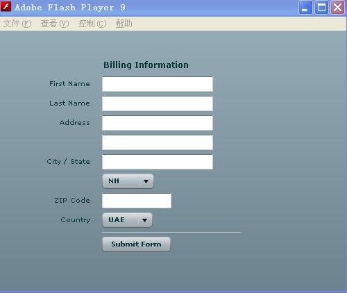
Grid通过网格的方法来放置组件,其实是把组件作为横纵方向的一个单元来实现的。<mx:Grd>来创建一个Grid容器。<mx:GridRow>创建每一行,但是这个标记必须是<mx:Grd>子标记。同样利用<mx:GridItem>可以创建每一行中的单元组件,而且这个标记也必须为<mx:GridRow>子标记。
|
<?xml version="1.0"?>
<!-- containers\layouts\Grid5Button.mxml -->
<mx:Application xmlns:mx="http://www.adobe.com/2006/mxml">
<mx:Grid id="myGrid">
<!-- Define Row 1. -->
<mx:GridRow id="row1">
<!-- Define the first cell of Row 1. -->
<mx:GridItem>
<mx:Button label="Button 1"/>
</mx:GridItem>
<mx:GridItem>
<mx:Button label="2"/>
</mx:GridItem>
<mx:GridItem>
<mx:Button label="Button 3"/>
</mx:GridItem>
<mx:GridItem>
<mx:Button label="Button 3a"/>
</mx:GridItem>

<mx:GridItem>
<mx:Button label="Button 3b"/>
</mx:GridItem>
</mx:GridRow>
<!-- Define Row 2. -->
<mx:GridRow id="row2">
<!-- Define a single cell to span three columns of Row 2. -->
<mx:GridItem colSpan="3" horizontalAlign="center">
<mx:Button label="Long-Named Button 4"/>
</mx:GridItem>
</mx:GridRow>
<!-- Define Row 3. -->
<mx:GridRow id="row3">
<!-- Define an empty first cell of Row 3. -->
<mx:GridItem/>
<!-- Define a cell to span columns 2 and 3 of Row 3. -->
<mx:GridItem colSpan="2" horizontalAlign="center">
<mx:Button label="Button 5"/>
</mx:GridItem>
</mx:GridRow>
</mx:Grid>
</mx:Application>
|
如图: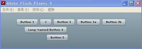
这个就比较简单了。Panel具有Canvas HBox VBox的所有功能,如果Panel的layout属性值为 absolute则Panel对子级元素的布局方式和Canvas一样当为 horizontal时则相当于 HBox 为vertical时则相当于VBox并且可以为 Panel指定标题.
|
<?xml version="1.0"?>
<!-- containers\layouts\TileSizing.mxml -->
<mx:Application xmlns:mx="http://www.adobe.com/2006/mxml">
<mx:Panel title="Panel layout" width="100%" height="100%">
    <mx:Label name="Label1"/>
    <mx:Button label="button1"/>
</mx:Panel>

</mx:Application>
|
效果如图:
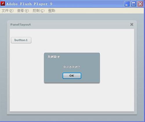
TitleWindow继承自Panel,与Panel相比,它只多了一个对象,那就是关闭按钮,通过 TitleWindow close事件触发该按钮的单击事件它并不会自动将TitleWindow本身关闭,而是通过我们为该事件所写的代码决定。
|
<?xml version="1.0"?>
<!-- containers\layouts\TileSizing.mxml -->
<mx:Application xmlns:mx="http://www.adobe.com/2006/mxml">
<mx:Script>
  <![CDATA[
         import mx.controls.Alert;
     private function closeEvent():void{
     Alert.show("you click the close","close");
     }
     ]]></mx:Script>
 <mx:TitleWindow title="Title" width="100%" height="100%" showCloseButton="true" close="closeEvent()">
 <mx:Button label="Button"/>
 </mx:TitleWindow>

</mx:Application>
|
效果如图:
所有的Titel容器中的单元组件都是具有相同大小尺寸的。这与Grid容器明显不一样了。这样就会出现这种情况,比如拟定每一行放置3个组件,你刚好有7个组件,那么就会分成3行放置,这样的话,最后一行就只有组件了。Title容器就具有这个特点。
|
<?xml version="1.0"?>
<!-- containers\layouts\TileSimple.mxml -->
<mx:Application xmlns:mx="http://www.adobe.com/2006/mxml">
<mx:Tile id="myFlow"
direction="horizontal"
borderStyle="solid"
paddingTop="10" paddingBottom="10"
paddingRight="10" paddingLeft="10"
verticalGap="15" horizontalGap="10">
<mx:TextInput id="text1" text="1" height="50" width="75"/>
<mx:TextInput id="text2" text="2" height="50" width="100"/>
<mx:TextInput id="text3" text="3" height="50" width="75"/>
<mx:TextInput id="text4" text="4" height="50" width="75"/>
<mx:TextInput id="text5" text="5" height="50" width="75"/>
</mx:Tile>
</mx:Application>
|
效果如图:

以上就是【Flex3 界面布局教程 第二篇】的全部内容了,欢迎留言评论进行交流!